Intro:
As a personal project, I undertook an analysis of data from Forbes' annual rankings of Africa's wealthiest billionaires from 2011 to 2023. The primary aim was to identify trends and patterns in the data and create an infographic to visualize my findings.
Process:
In order to successfully complete this project, I meticulously followed a five-phase process (Ask, Prepare, Clean, Analyse and Visualise). Firstly, I defined the key questions I wanted to answer with the dataset:
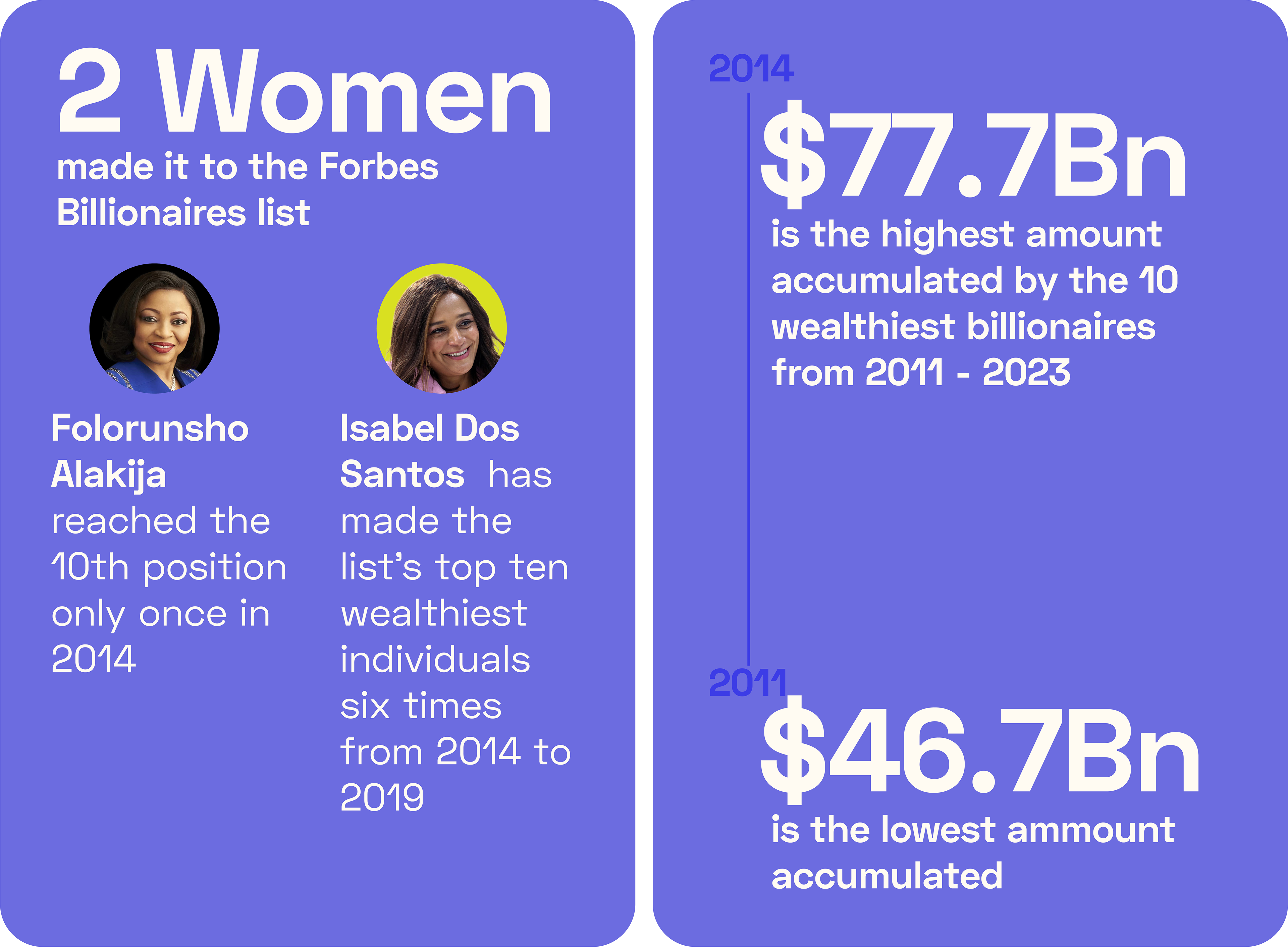
1. How many women appeared on the list over the years?
2. How frequently did billionaires make it to the list?
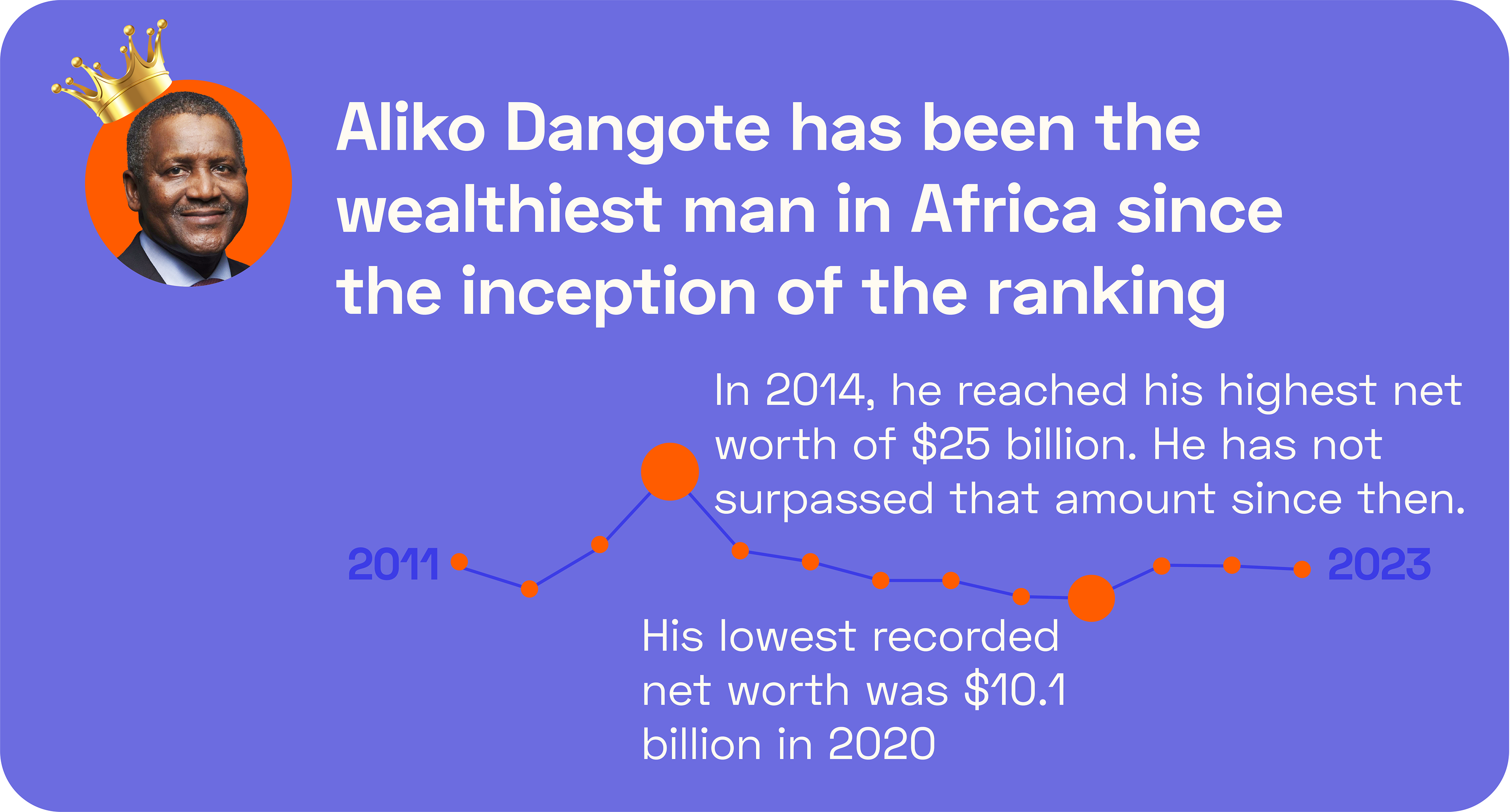
3. During which years were the richest people the wealthiest and when were they the least rich?
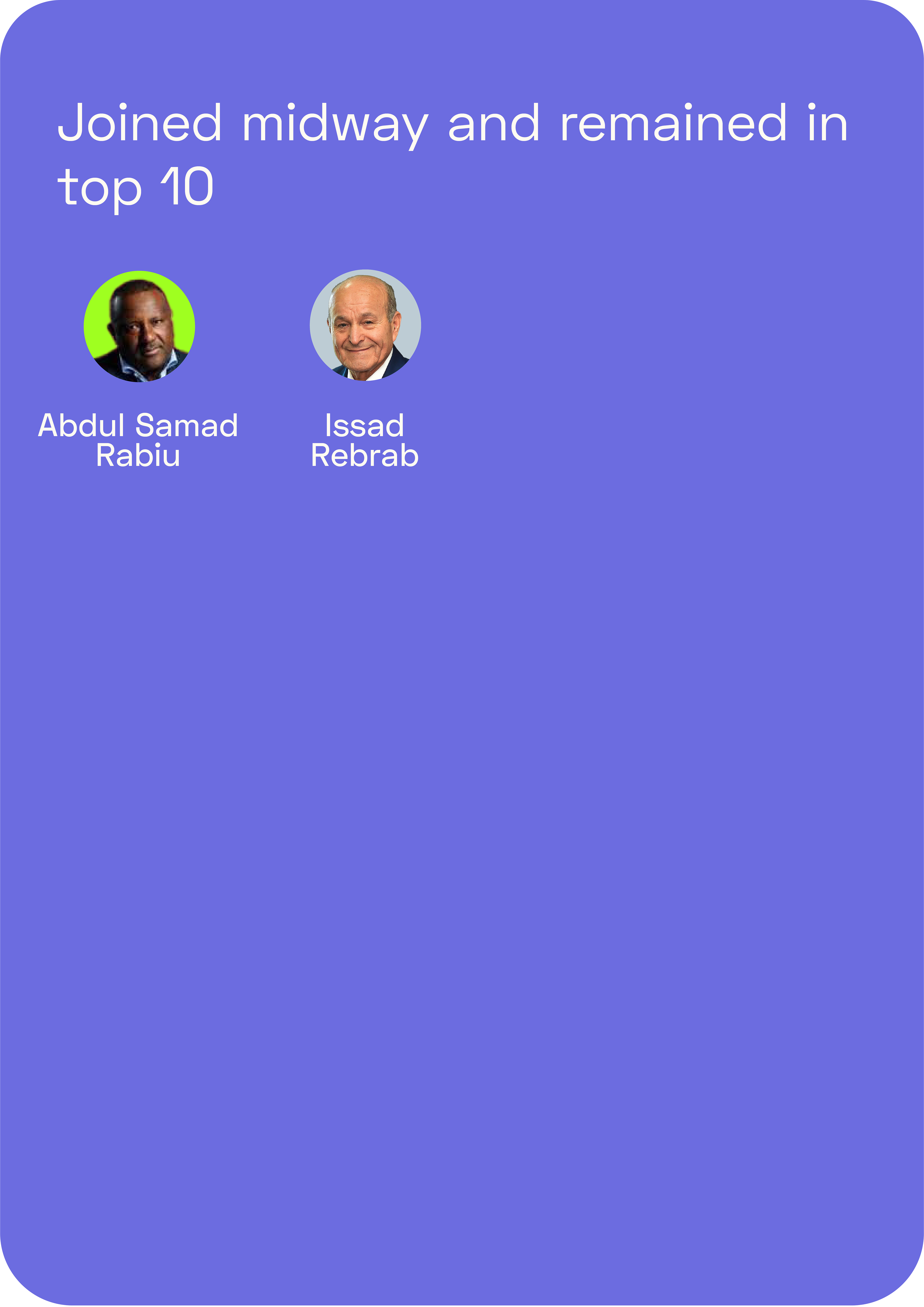
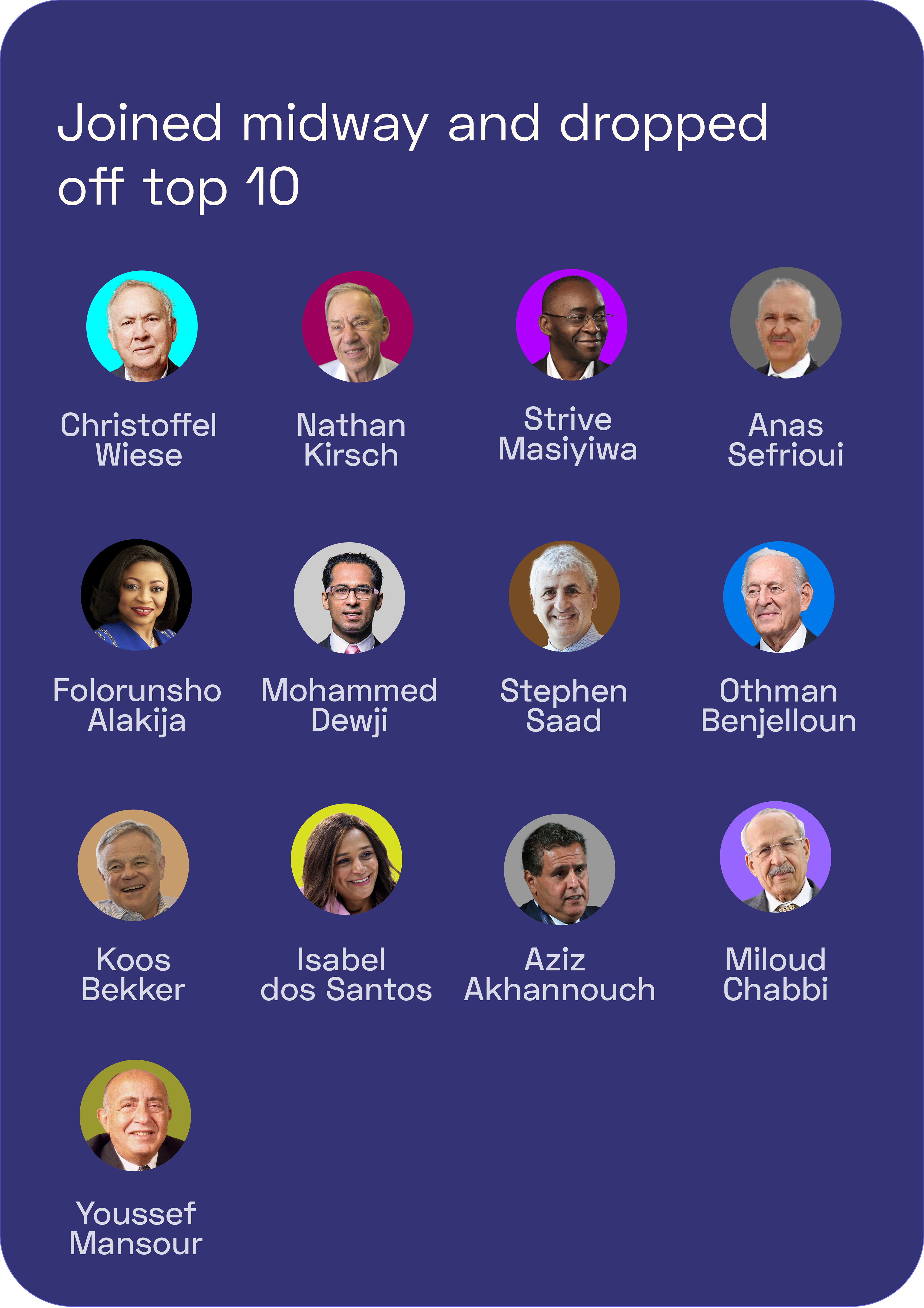
4. Who left the list and who remained?
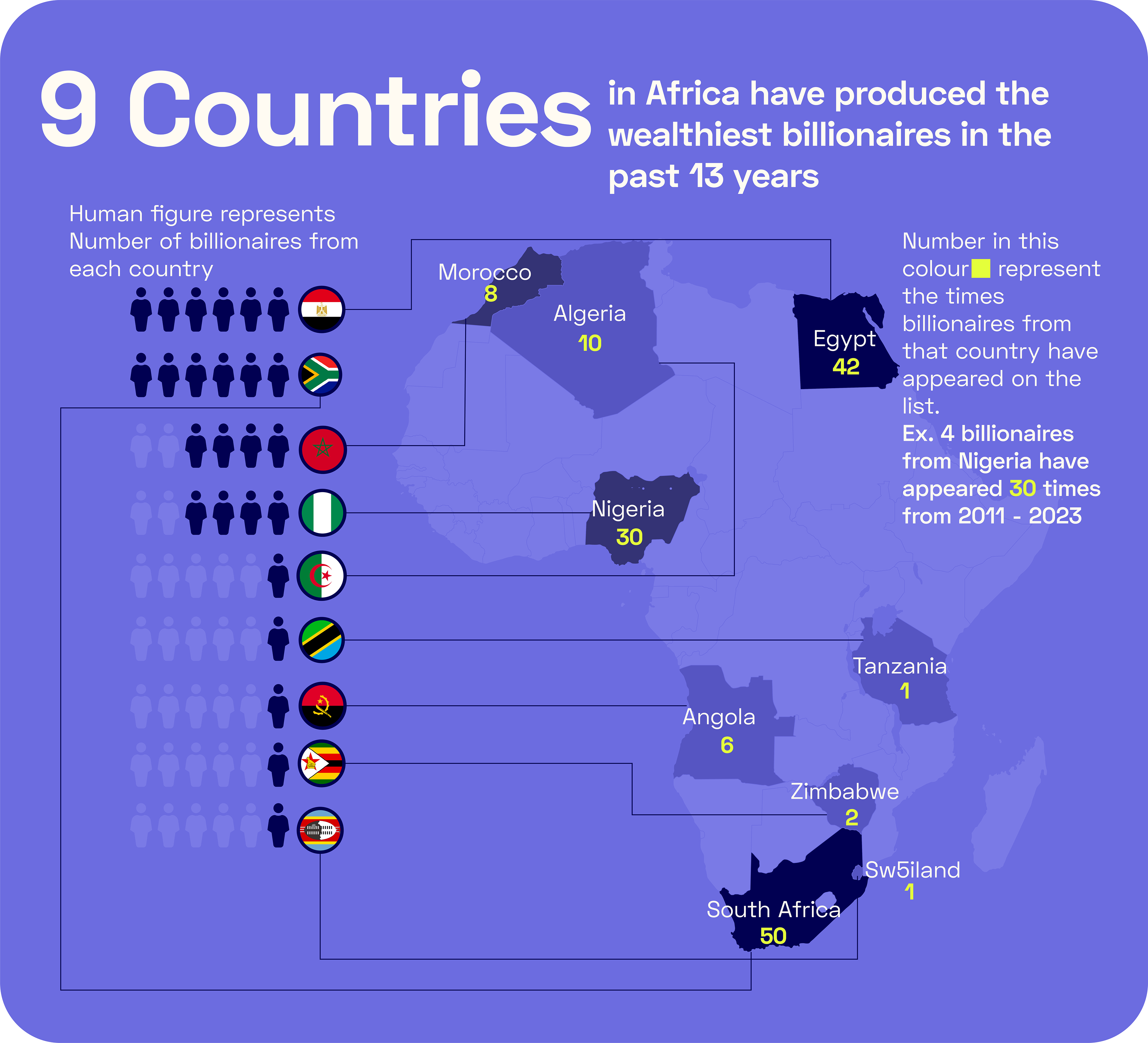
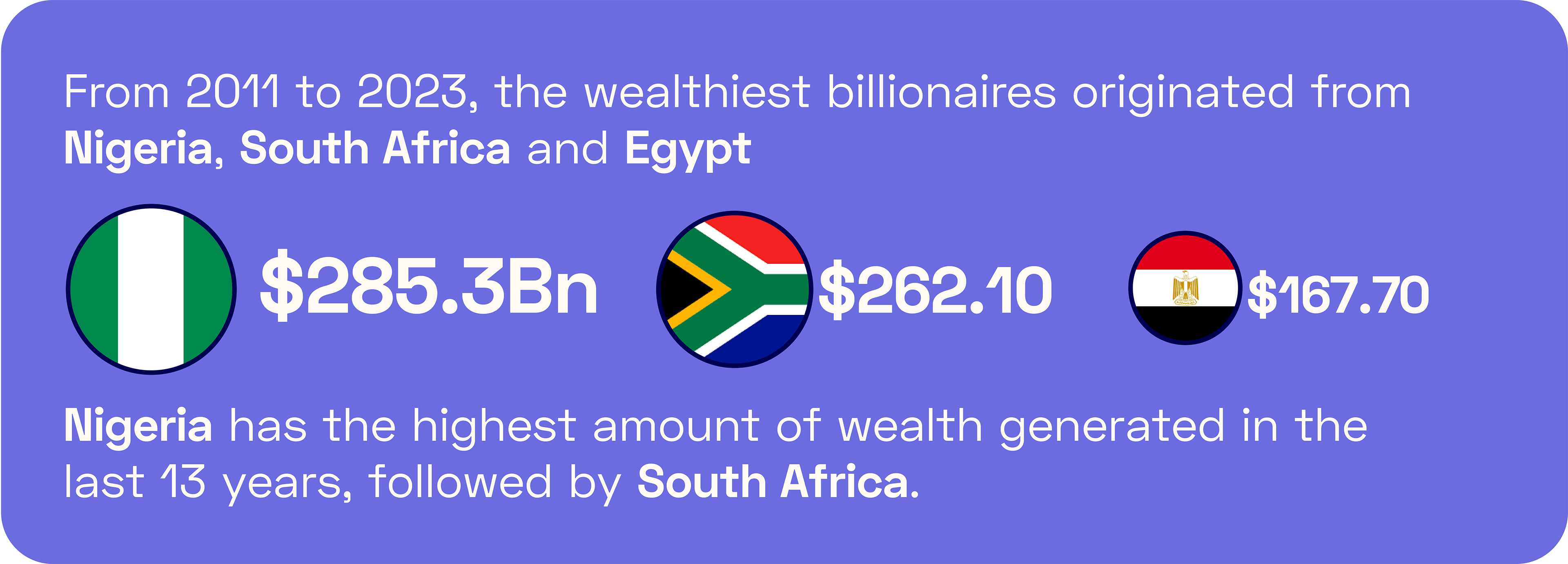
5. How frequently did different countries appear on the list?
Despite my extensive online searches, I couldn't find a readily available dataset on African billionaires and their net worth. Consequently, I had to manually search Forbes' website and build the dataset from scratch. I collated all the data from the Forbes African Billionaires list into a spreadsheet. The link to the data is here.
Once I had created a satisfactory dataset, I cleaned and filtered it, carefully scrutinizing it for any errors. This was a critical phase in the project as any errors in the dataset would have compromised the validity of the analysis. At this point, I could explore the data and find answers to my initial questions.
Outcome
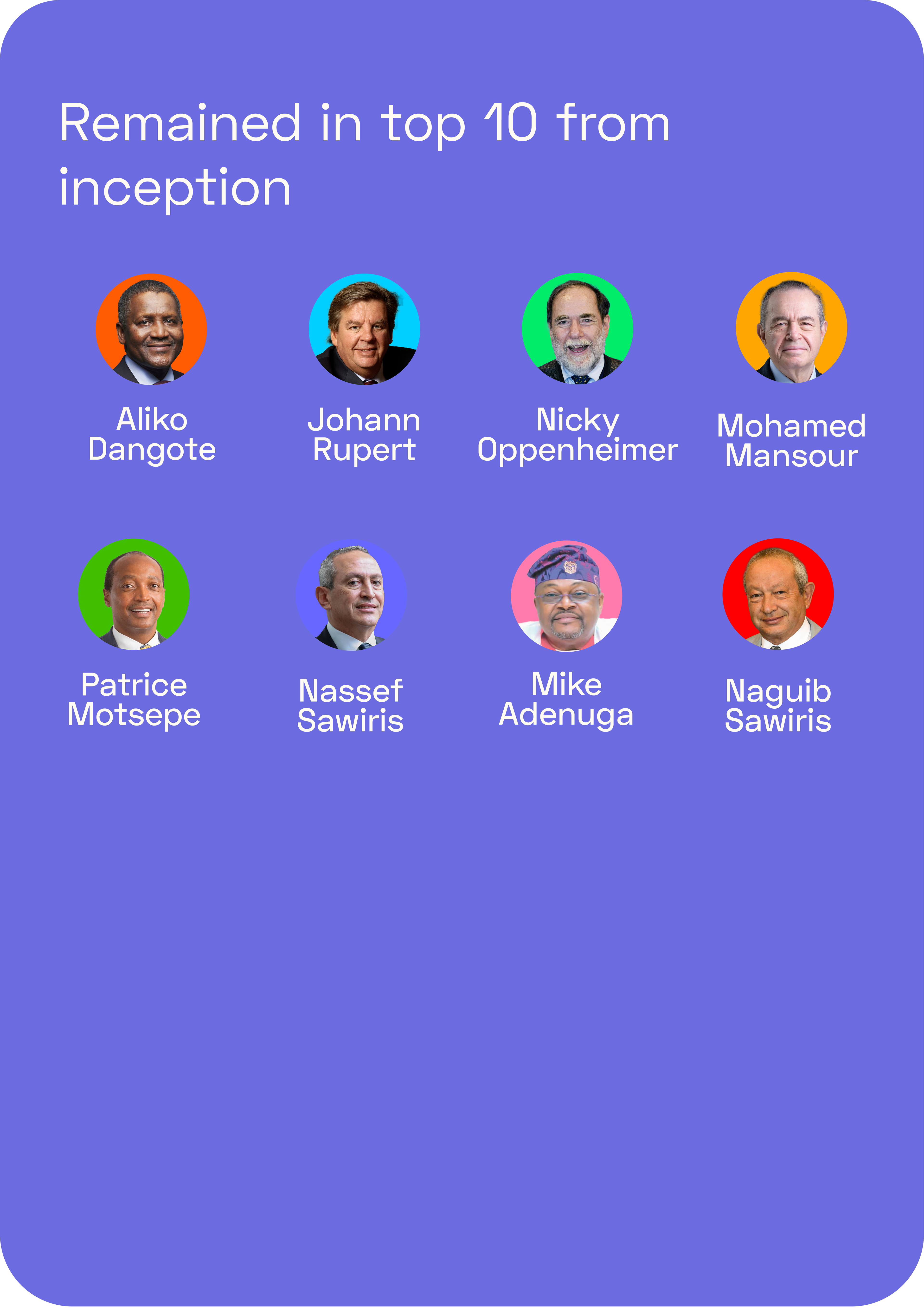
After analyzing the data, I discovered that only two women made it to the top of the list over the years. The data also revealed that a significant proportion of billionaires on the list were repeat entries, and eight of the original top billionaires maintained their positions in the most recent report.
Furthermore, the analysis showed that the period between 2014 and 2015 had the highest number of accumulated wealth from billionaires, while 2011 and 2012 had the least.
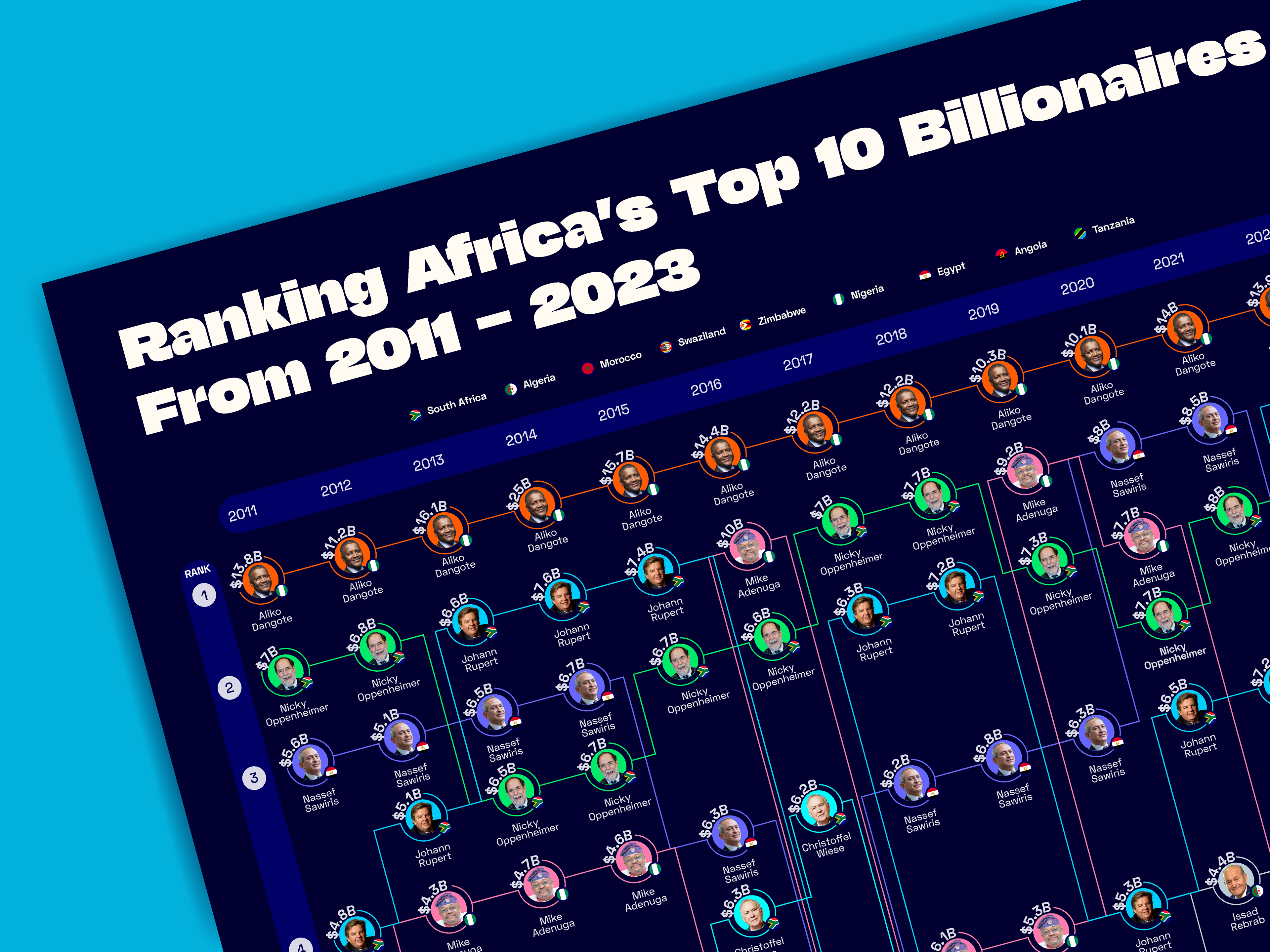
Using the data, I created an infographic that visualizes the top 10 billionaires in Africa for the last 13 years and their corresponding ranks in each year. Bite-sized infographics were also created to easily explain the findings and answers to the initial questions.
Conclusion
This project was an excellent opportunity for me to develop skills in data analysis, data cleaning, data exploration, and data visualization. It showcases my ability to conduct in-depth analysis and transform complex data into easily understandable and visually appealing graphics.

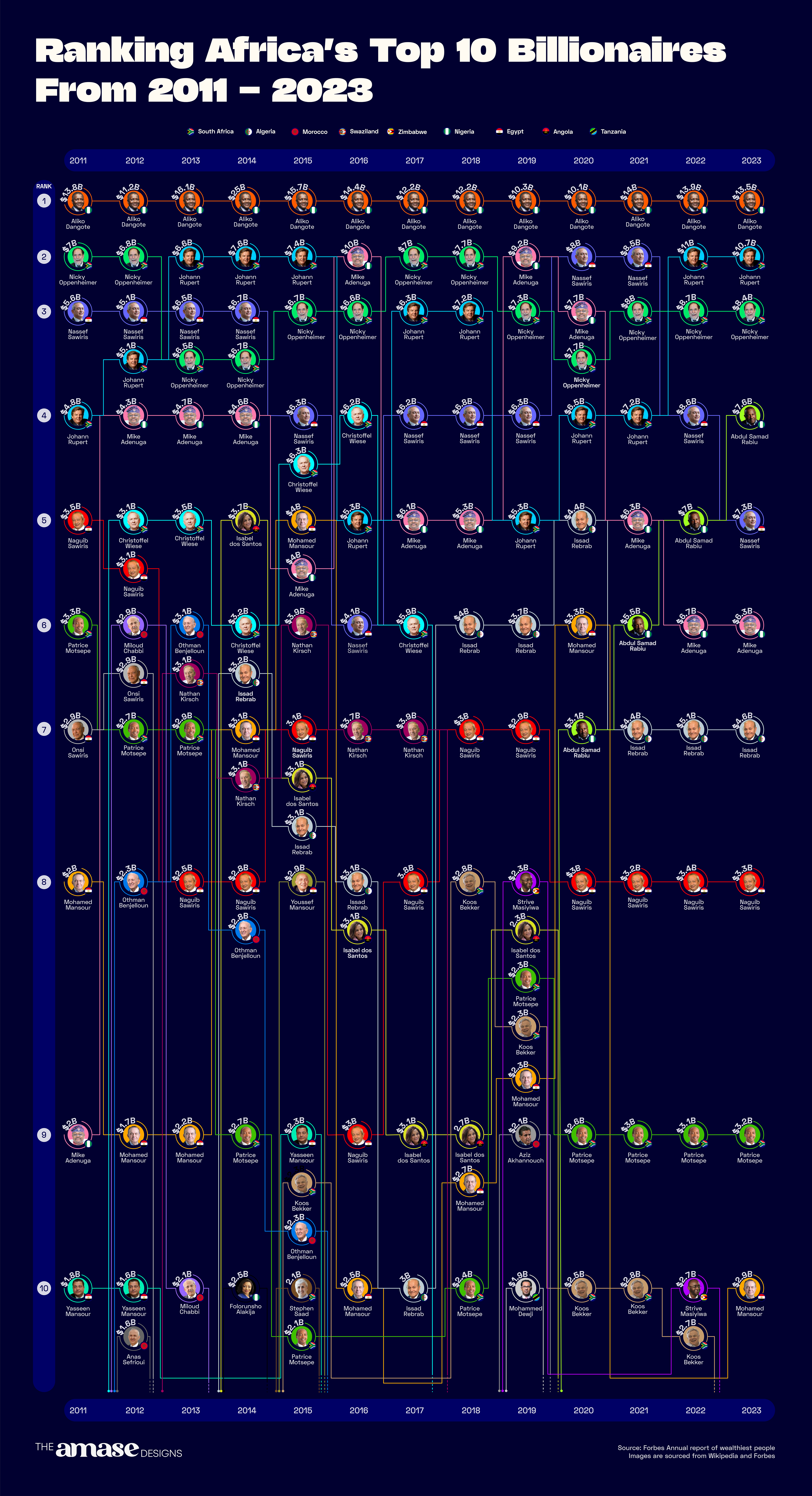
A full infographic showing the Top wealthiest Africans in the past 13 years