Challenge
The brand needed to clearly communicate its core purpose: frictionless shopping across multiple stores in one place, while differentiating itself from delivery apps that either feel too playful (low-trust) or too corporate (low relatability). The brand also needed to visually express “shopping empowerment” — the customer being in control.
Approach
The identity was built to balance high usability (for app and digital UI) with emotional clarity:
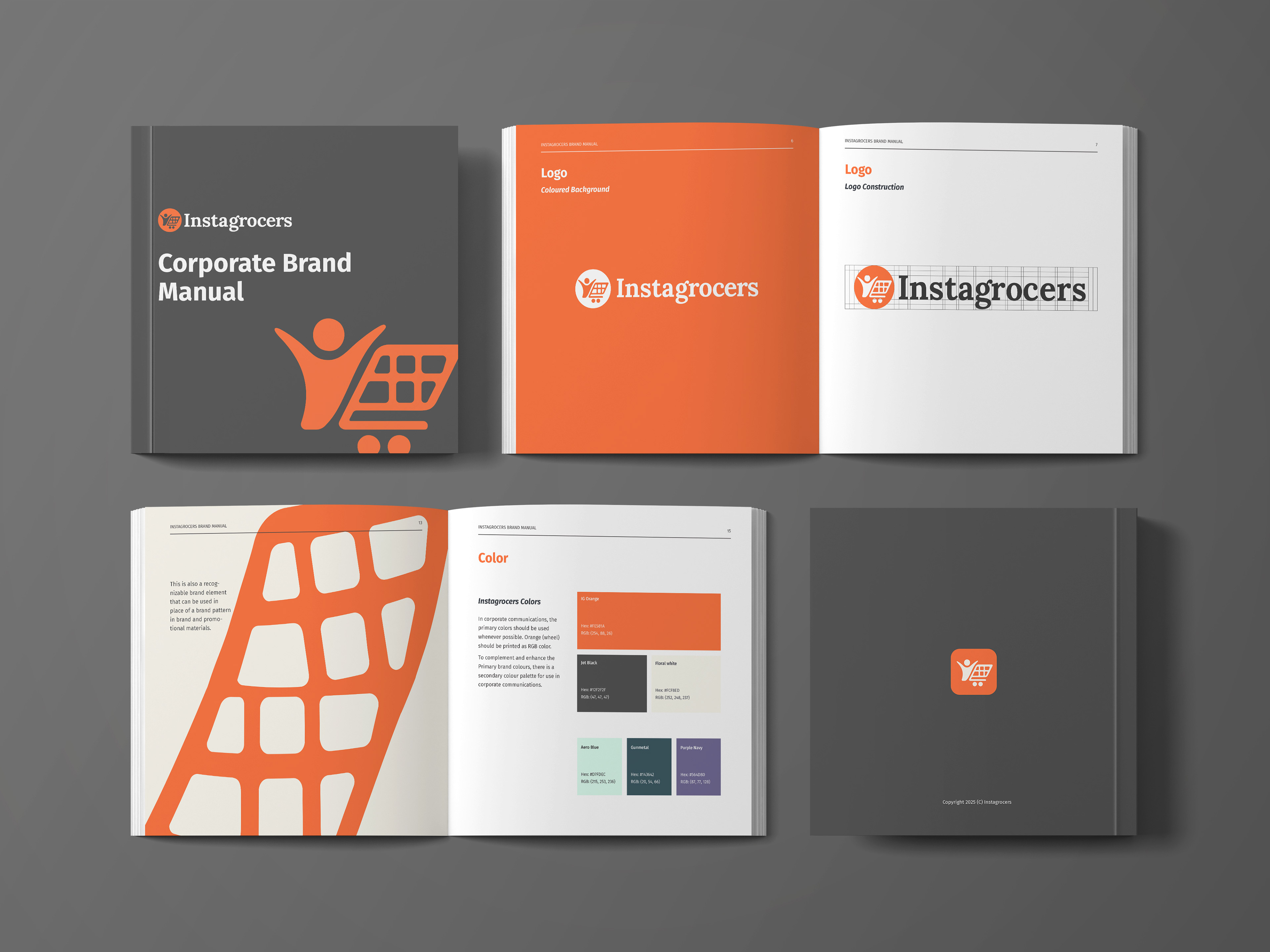
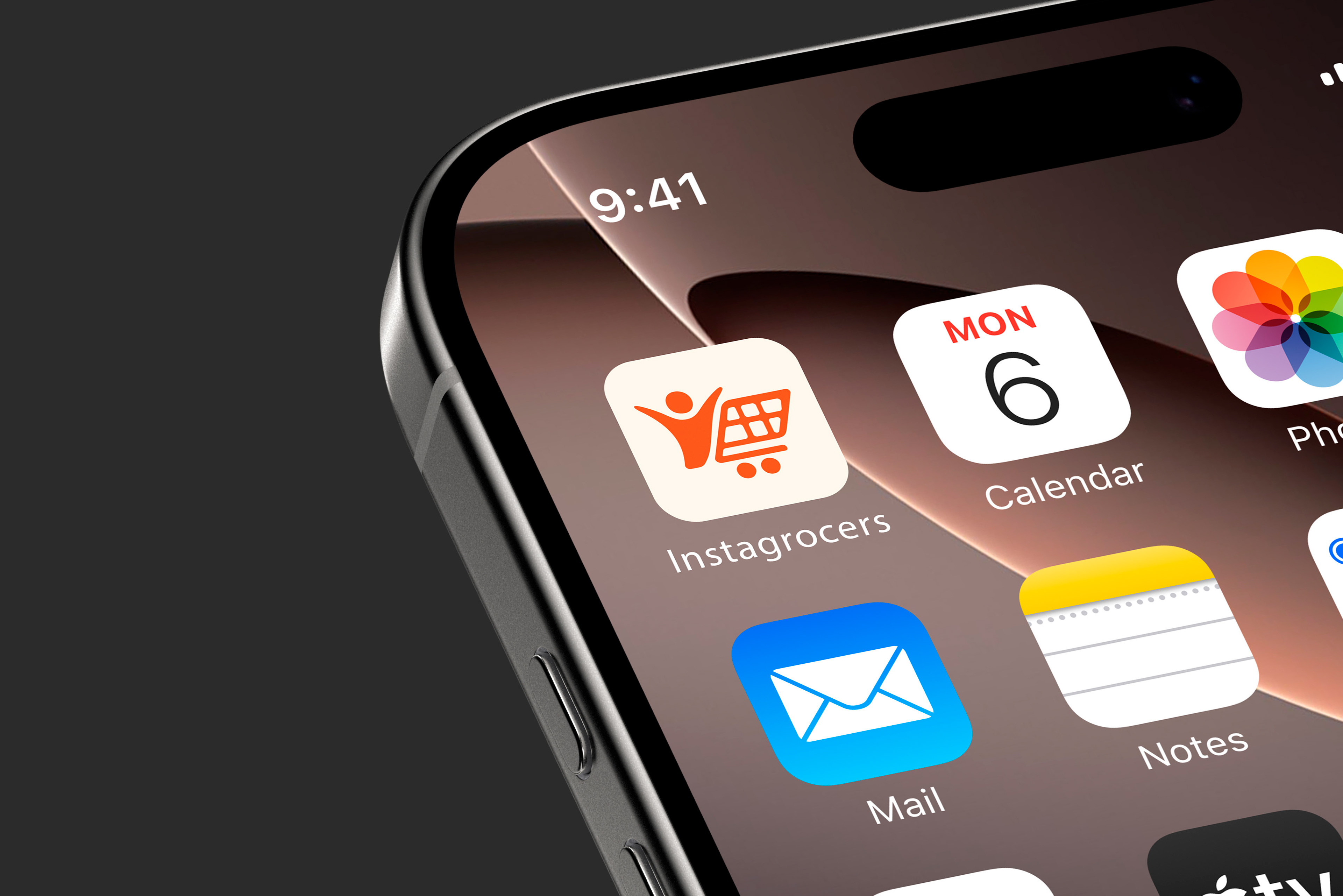
Human-Centered Symbol: The logo integrates a human figure pushing a cart, establishing immediate association with shopping convenience and user agency.
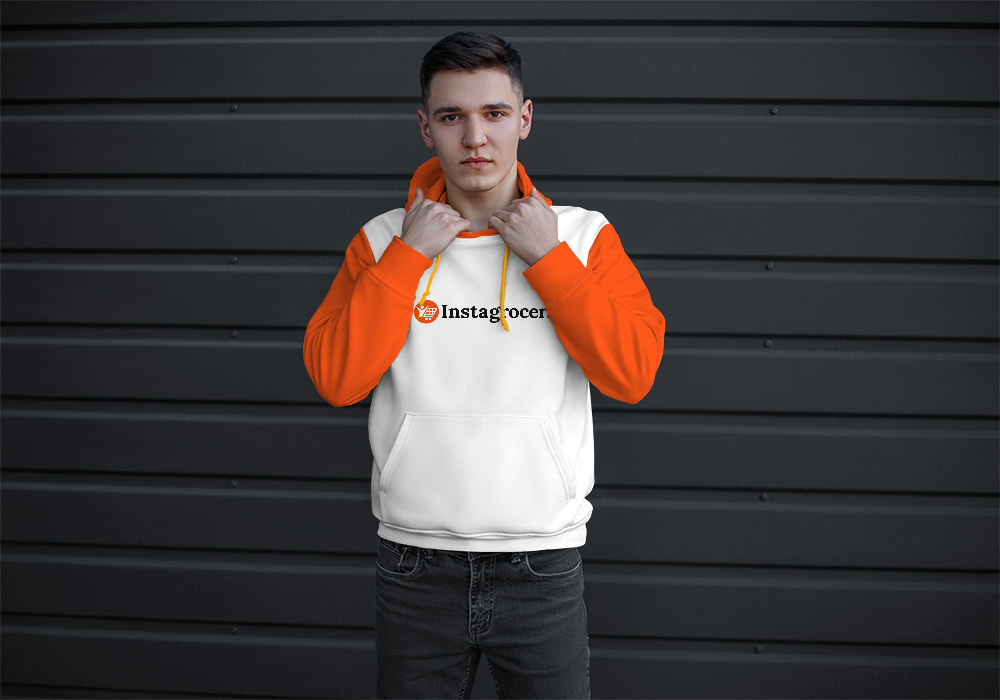
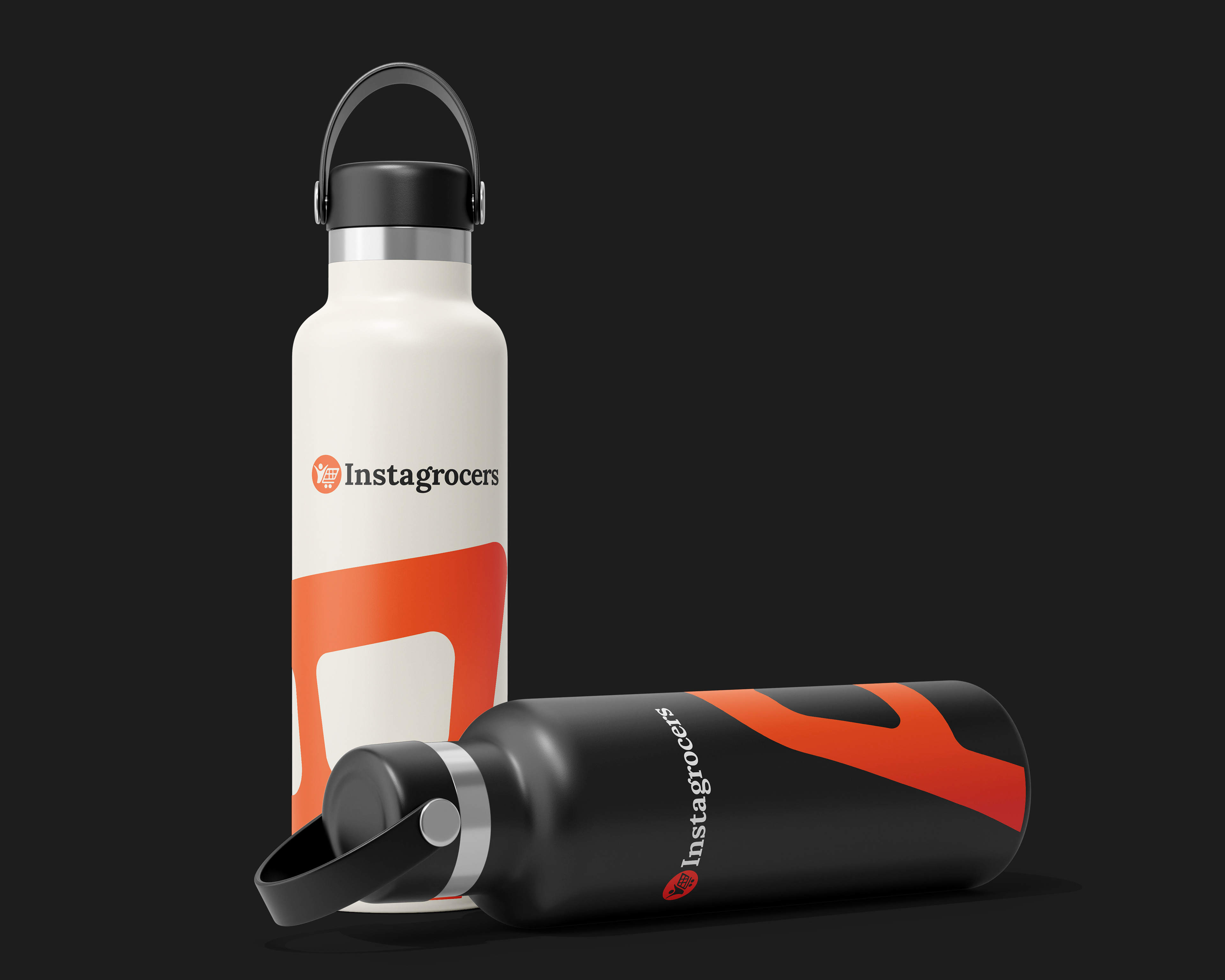
Action-Driven Color System: A vibrant orange (energy, speed, ease) was contrasted with a deep charcoal (trust, stability) to signal reliability without dullness.
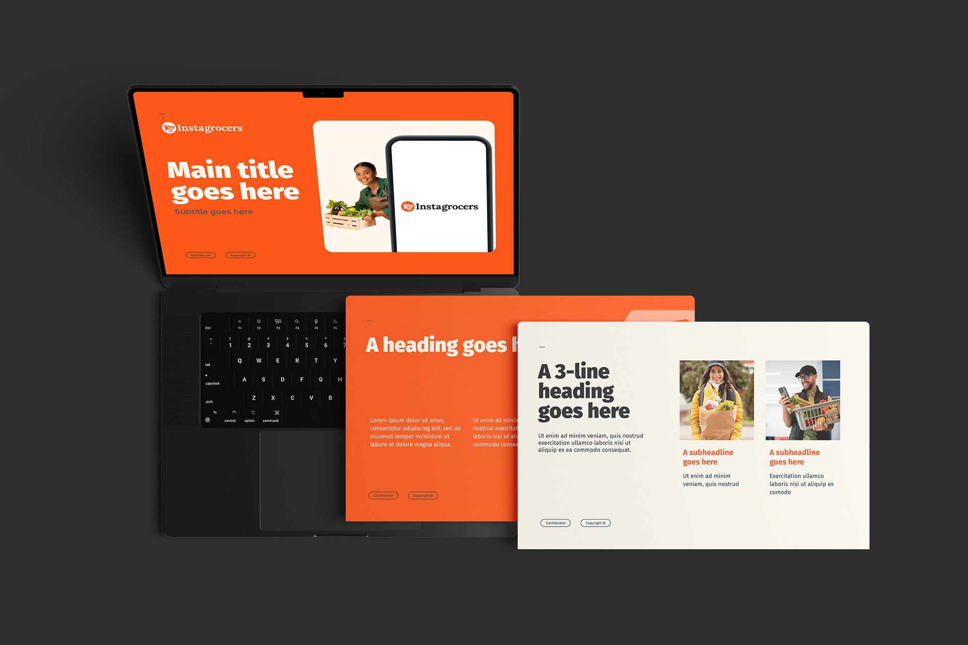
Digital-First Typography: Clean, bold letterforms were used to ensure legibility across interfaces, from app icons to delivery vans.
Outcome
A scalable, cohesive brand system that communicates convenience and empowerment across digital and physical touchpoints, supported by a usage guideline that ensures consistent execution as the platform expands.