The Challenge:
The organic skincare category is saturated with visually homogenous brands (minimalist design, light sans-serif fonts). The client needed a distinct visual system to convey "purity and precision" while ensuring differentiation for its high-end target audience.
Visual Strategy
The identity was built on three functional design systems to combat visual noise:
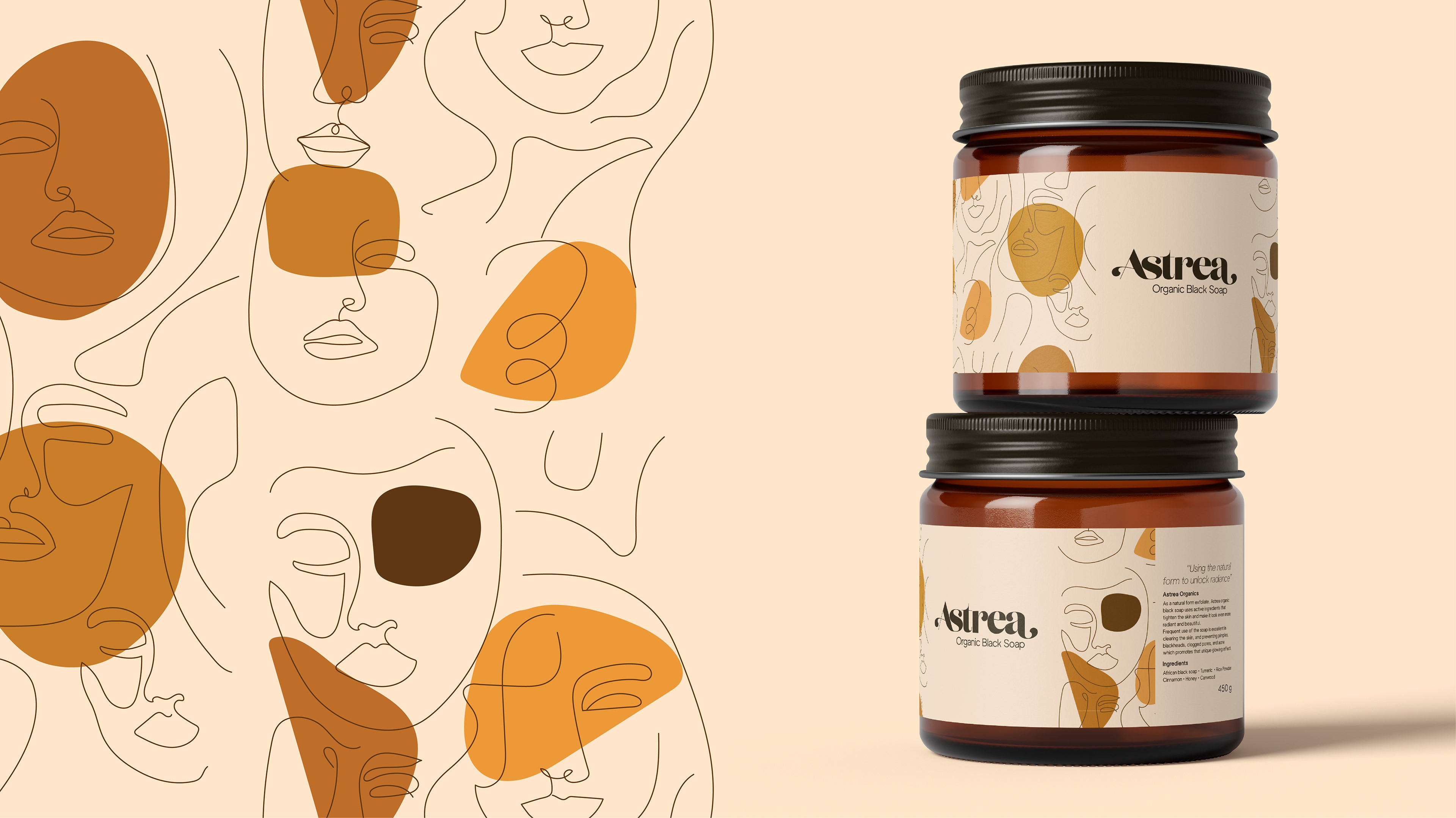
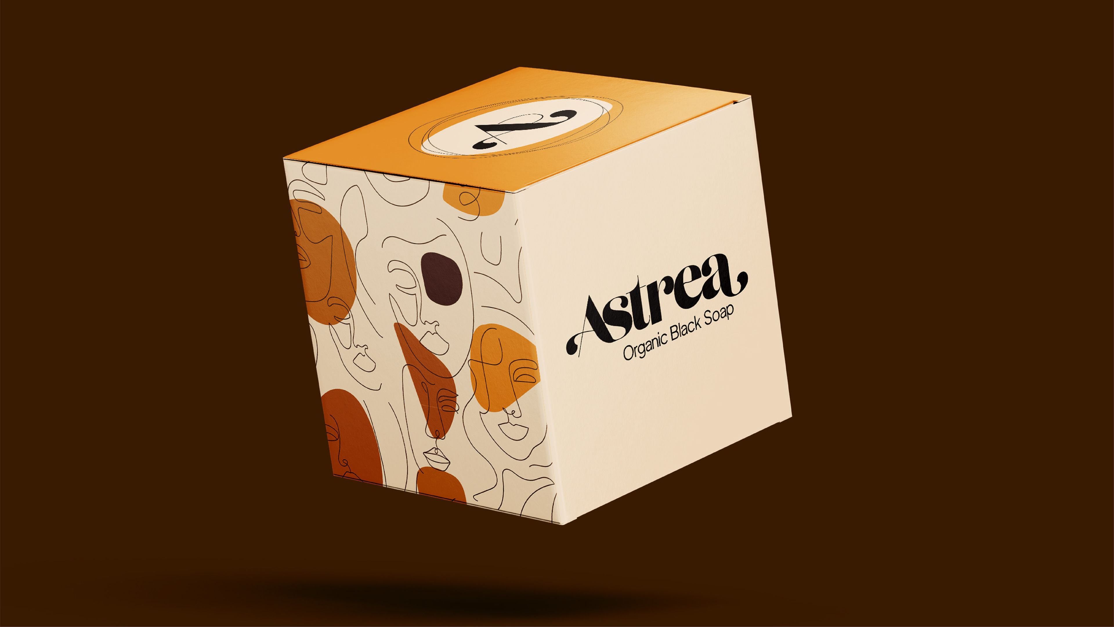
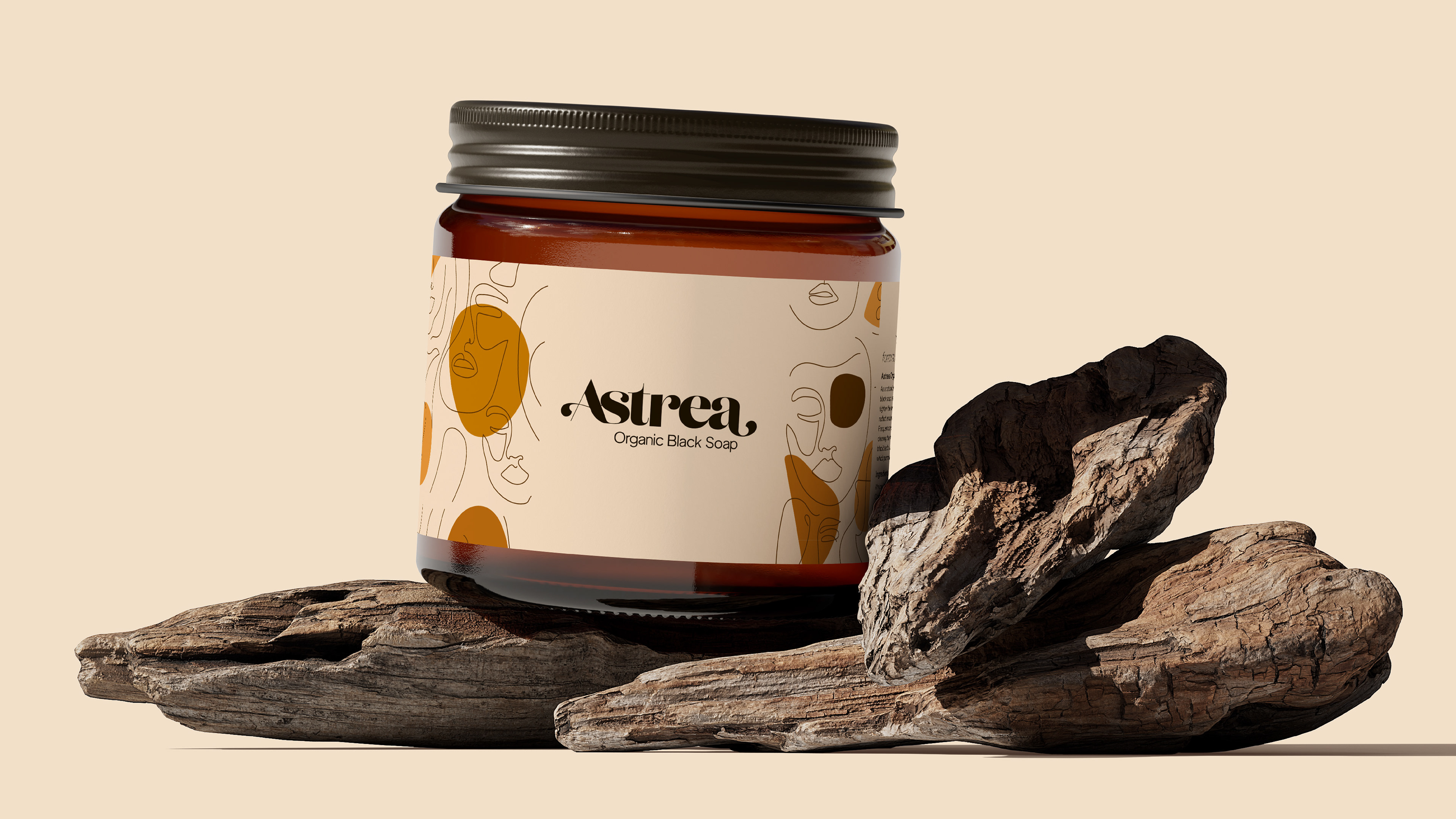
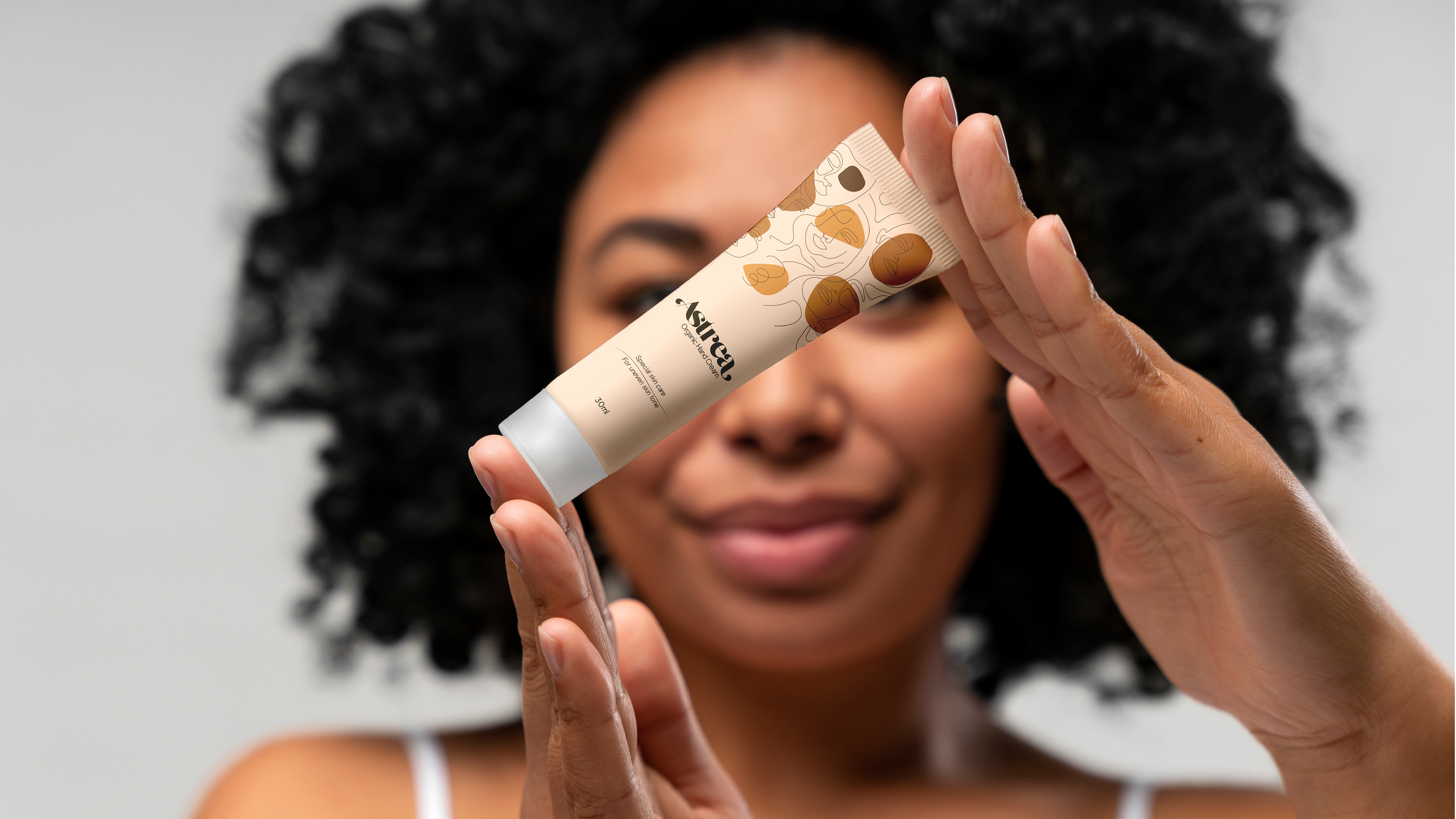
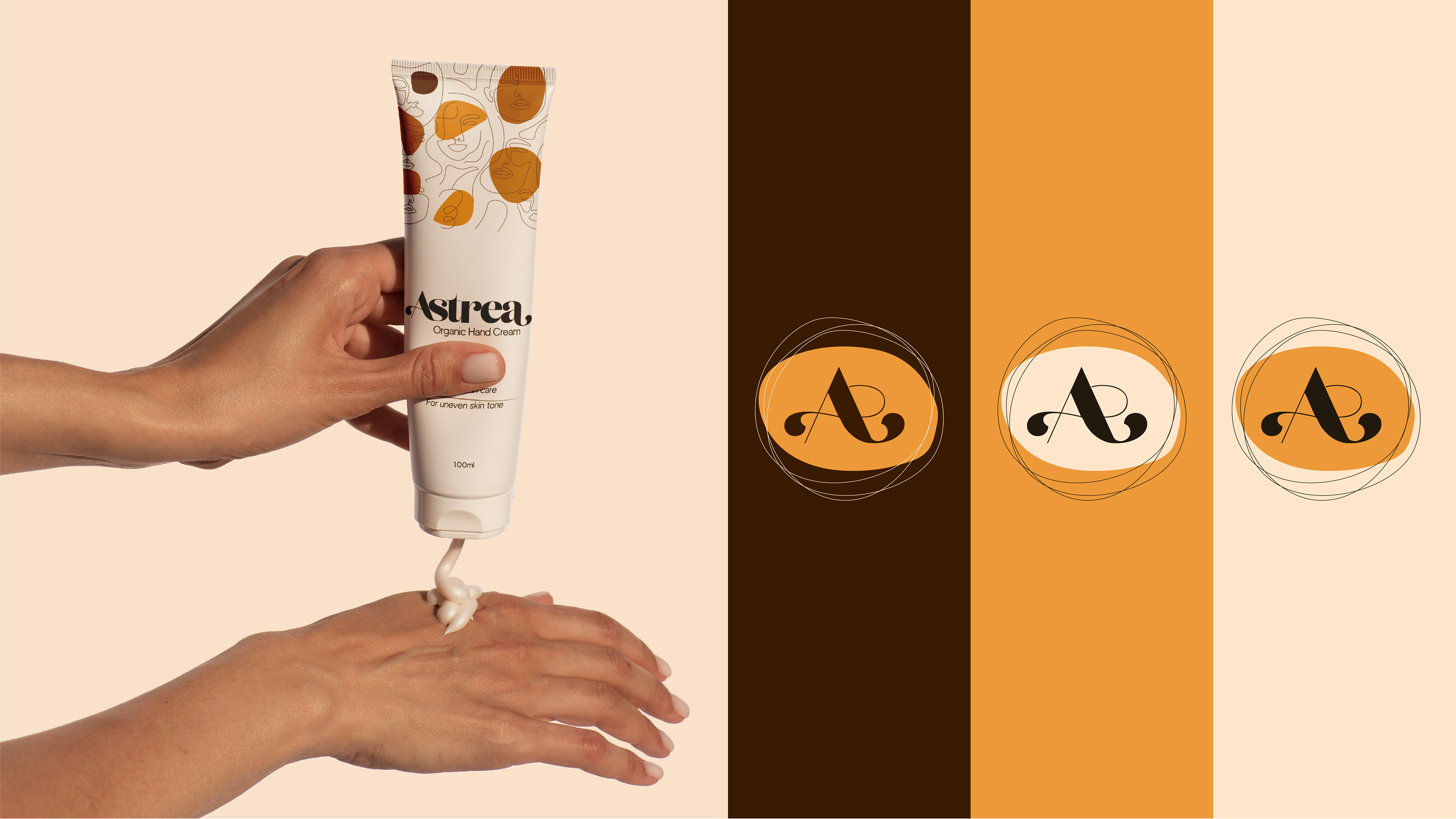
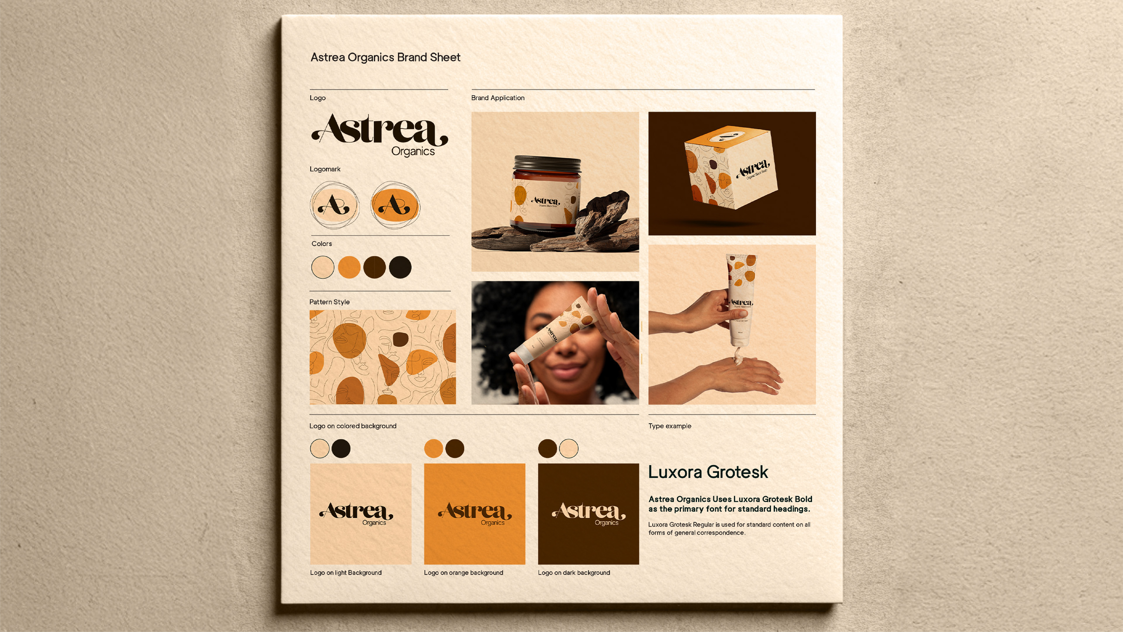
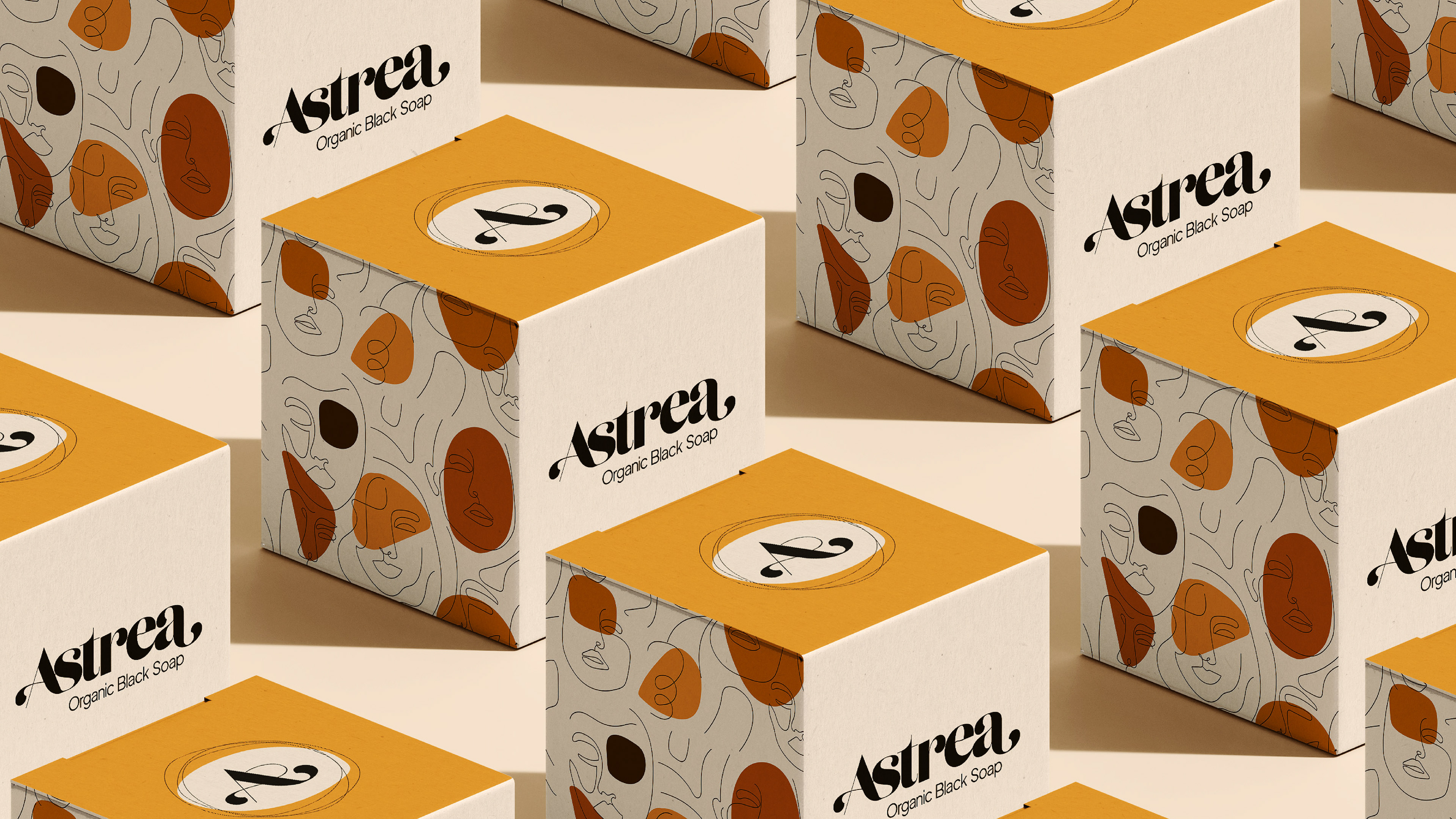
Fluid Wordmark: Designed to contrast category rigidity, conveying natural flow and organic purity
Functional Color Palette: A vivid, proprietary color system was established (deviating from soft pastels) to create immediate shelf contrast.
Differentiating Pattern: A unique, branded pattern was created as a flexible brand asset for use across packaging, print, and digital media, ensuring high brand recognition.
Outcome
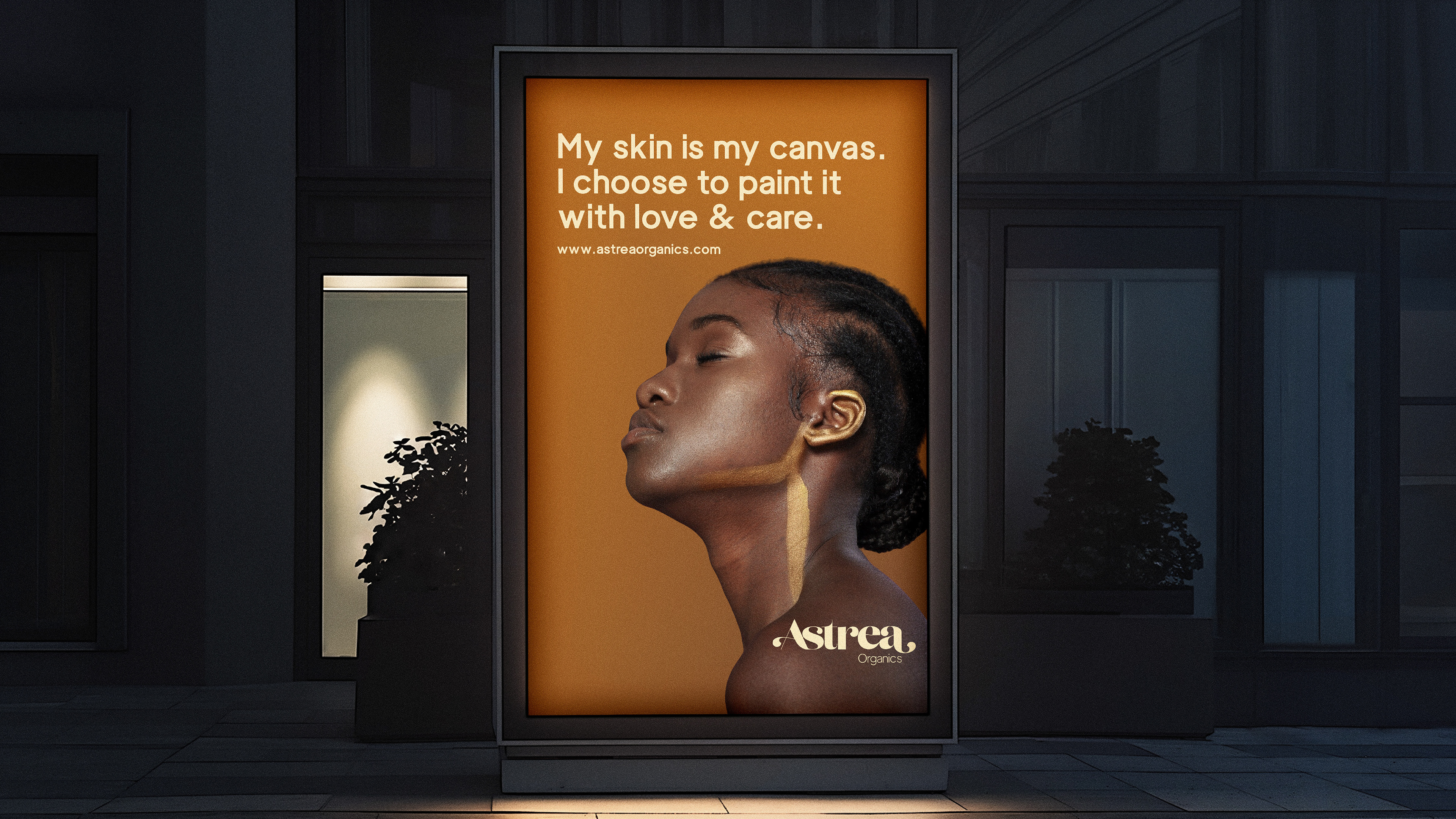
Successfully established a recognisable, scalable brand system that uses functional design elements to communicate a premium, organic value proposition and solve the problem of visual homogeneity.