
Challenge
Macrostrat operates between government institutions and private-sector implementation partners. They needed a visual identity that avoided being too corporate (rigid, institutional) or too casual (informal), while signaling credibility, balance, and strategic guidance.
Approach
The identity was built on the principle of connection and mediation:
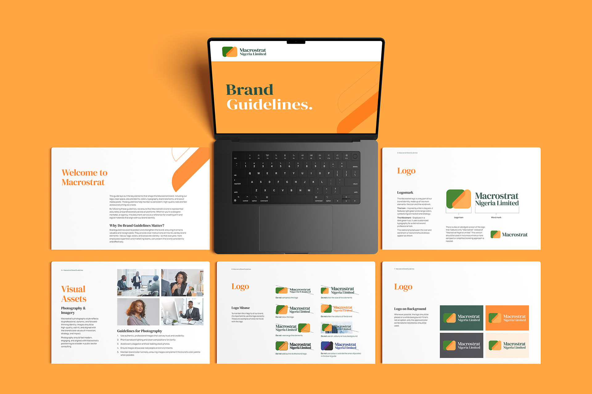
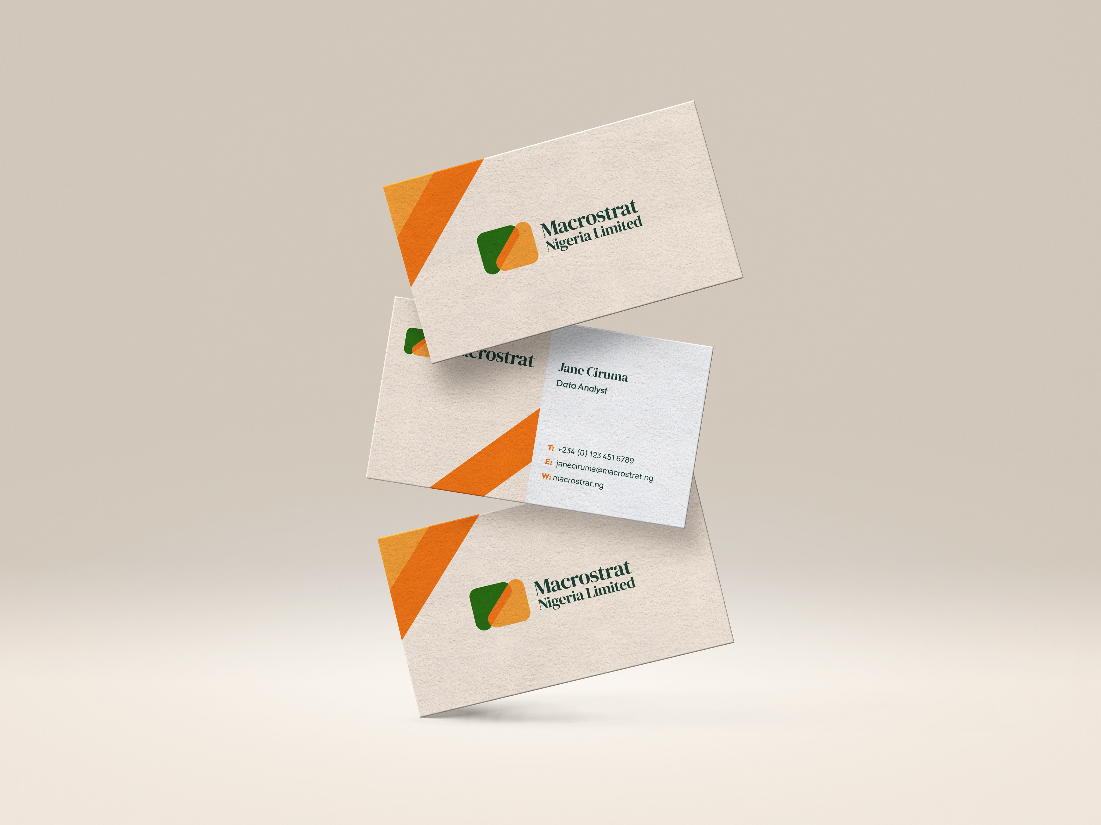
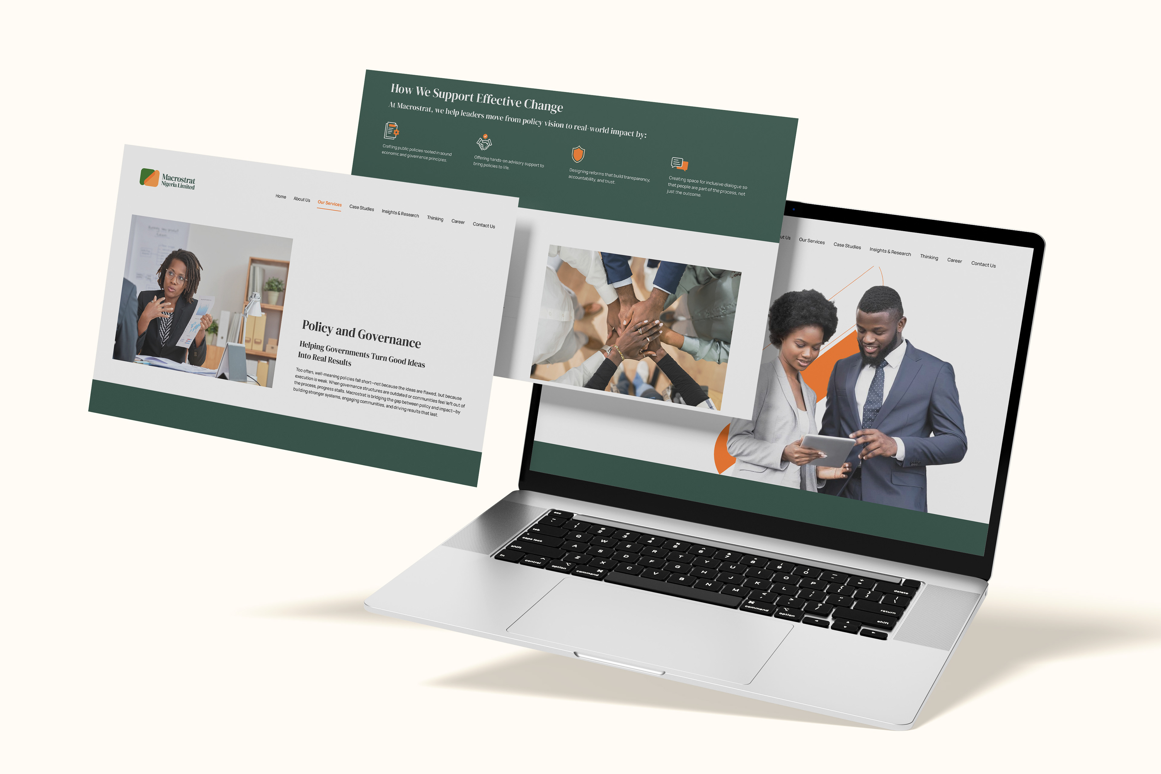
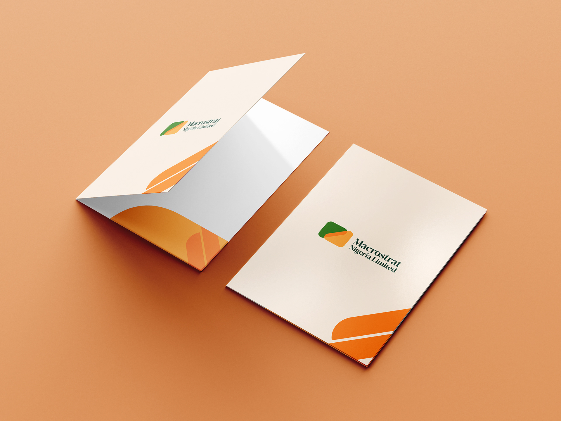
Symbolic Form Construction: The logo features two intersecting shapes, representing policy and execution meeting at a functional midpoint — communicating alignment and coordination.
Meaning-Driven Color Palette: The green and orange palette (client-preferred) was refined to reflect growth, clarity, and activation — ensuring the contrast supports professional warmth rather than corporate stiffness.
Structured Yet Approachable Aesthetic: Rounded geometry and softened edges were used to maintain authority while reinforcing accessibility and collaborative identity.
Outcome
Delivered a distinctive, non-generic brand identity that reflects Macrostrat’s role as a bridge between policy and action, supported by a flexible visual system adaptable to presentations, reports, and stakeholder communication.