Challenge
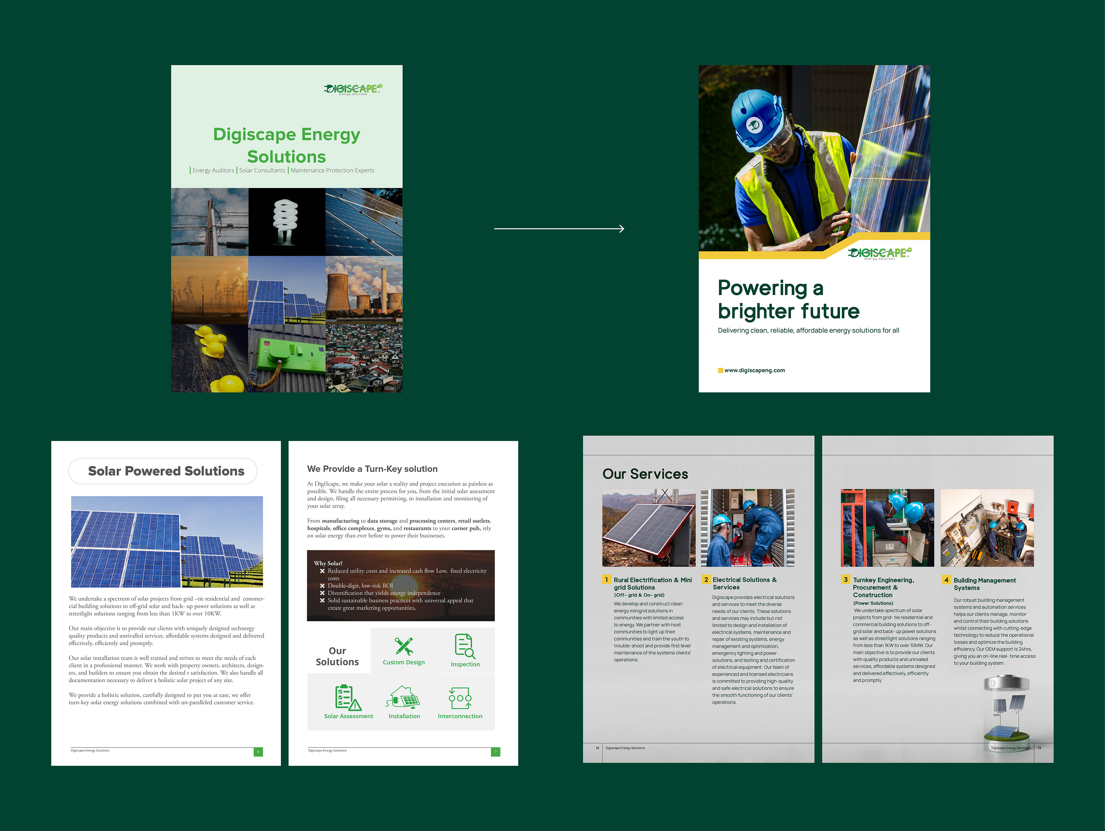
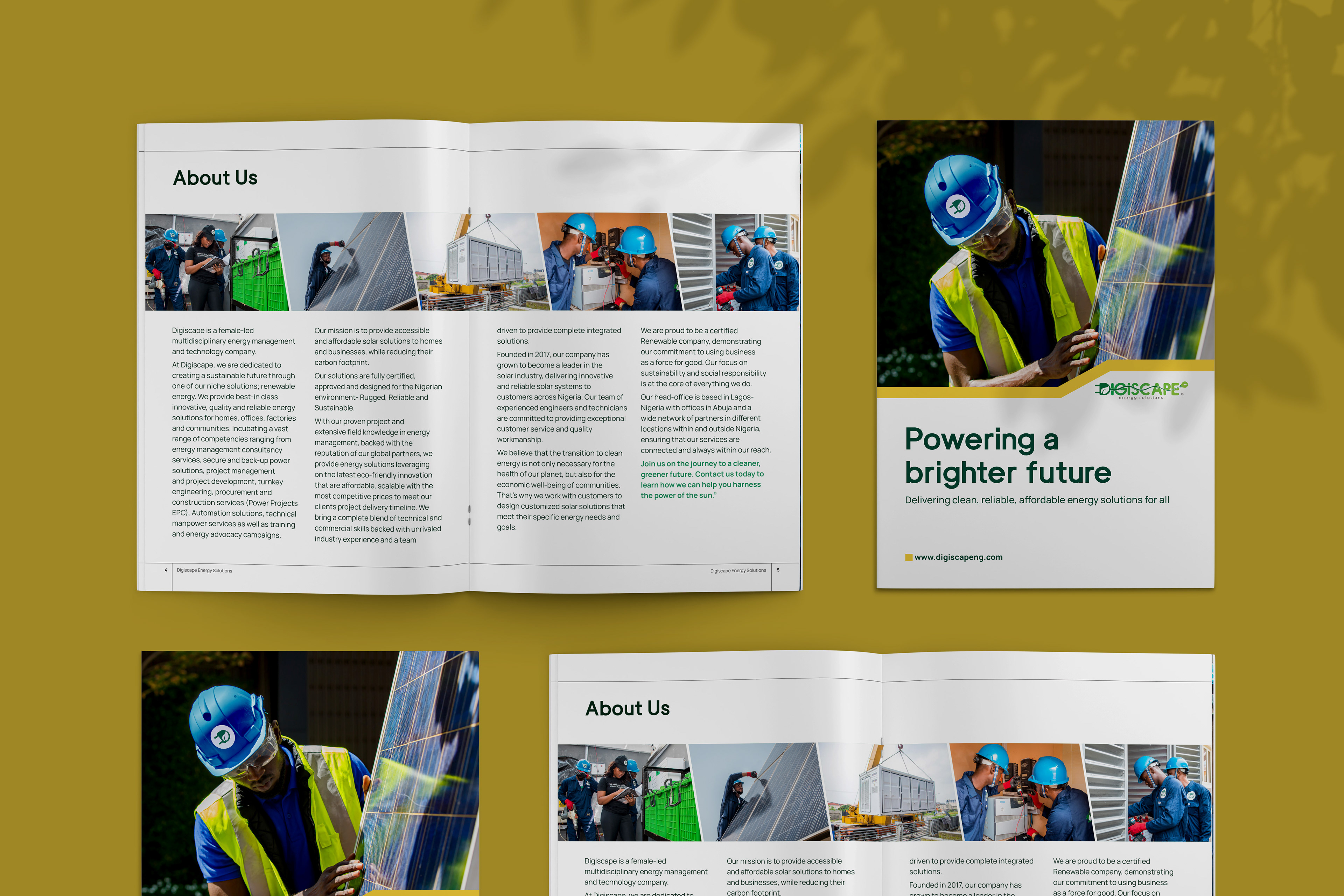
Digiscape had outgrown its previous company profile. Their visual identity didn’t match their evolving scope, capabilities, and market positioning, and they needed a profile that reflected who they had become.
Approach
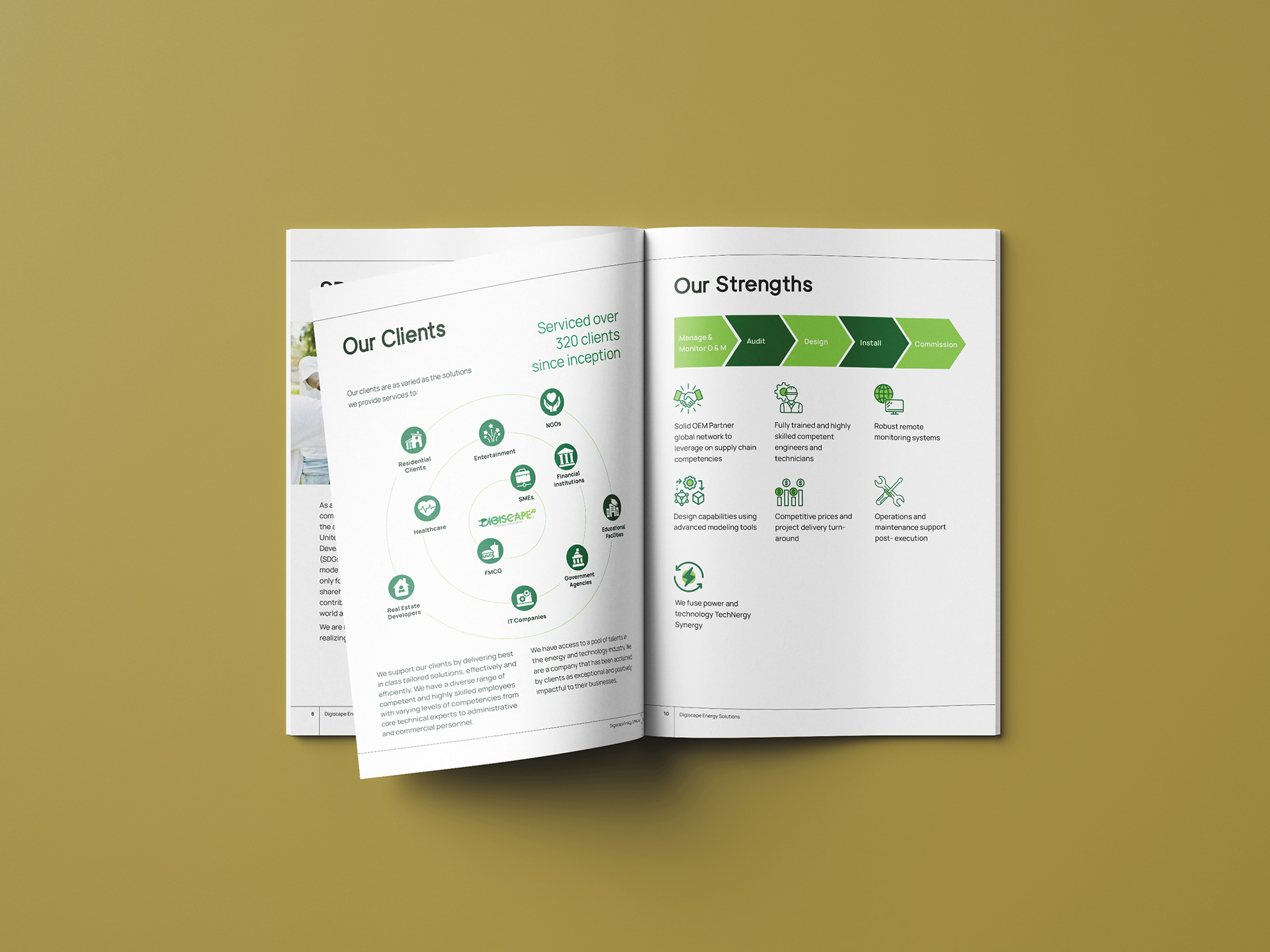
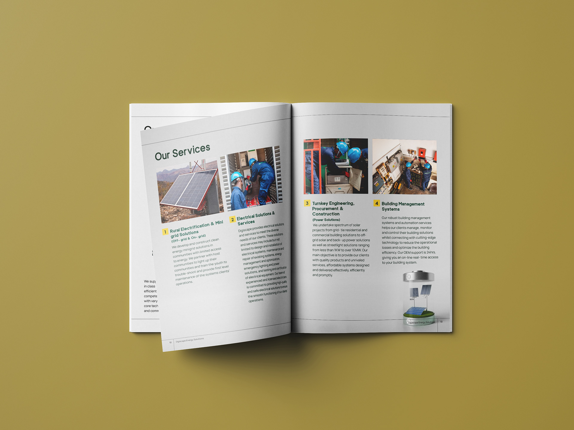
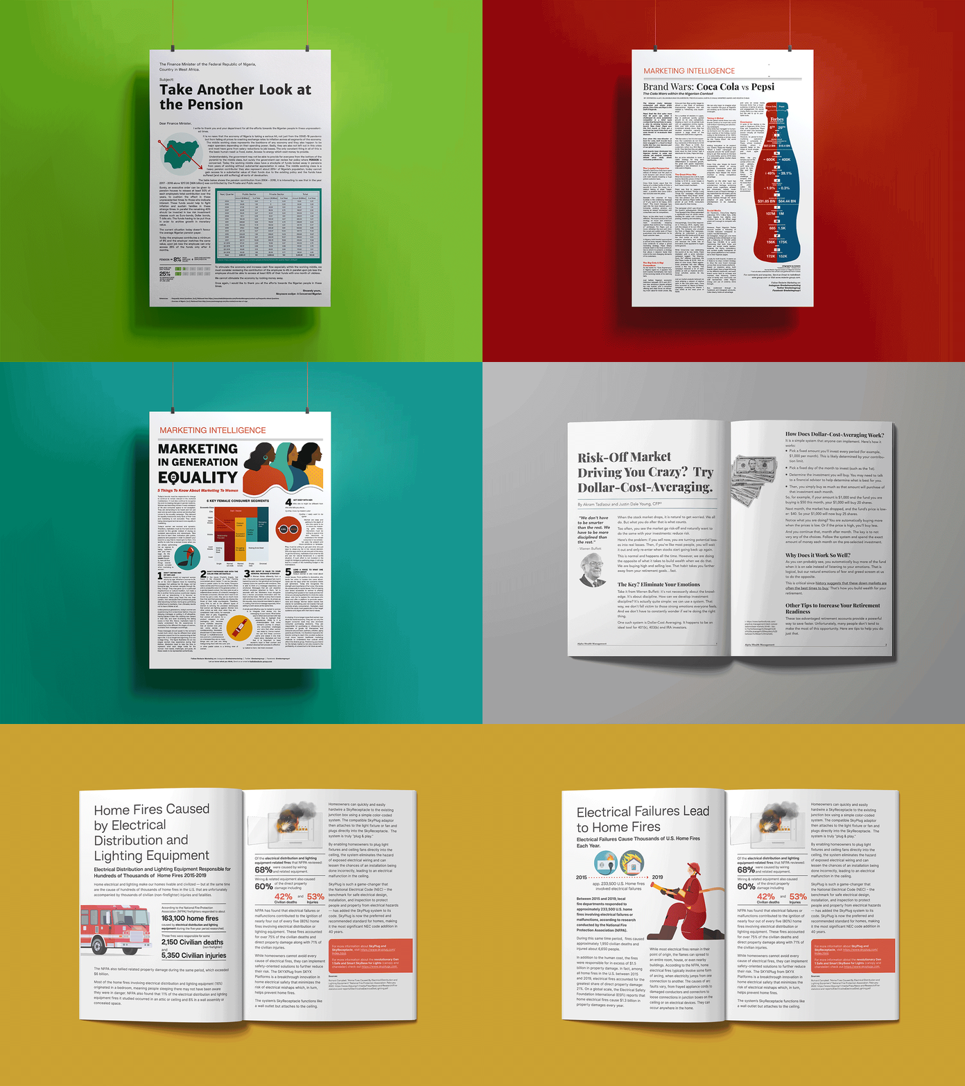
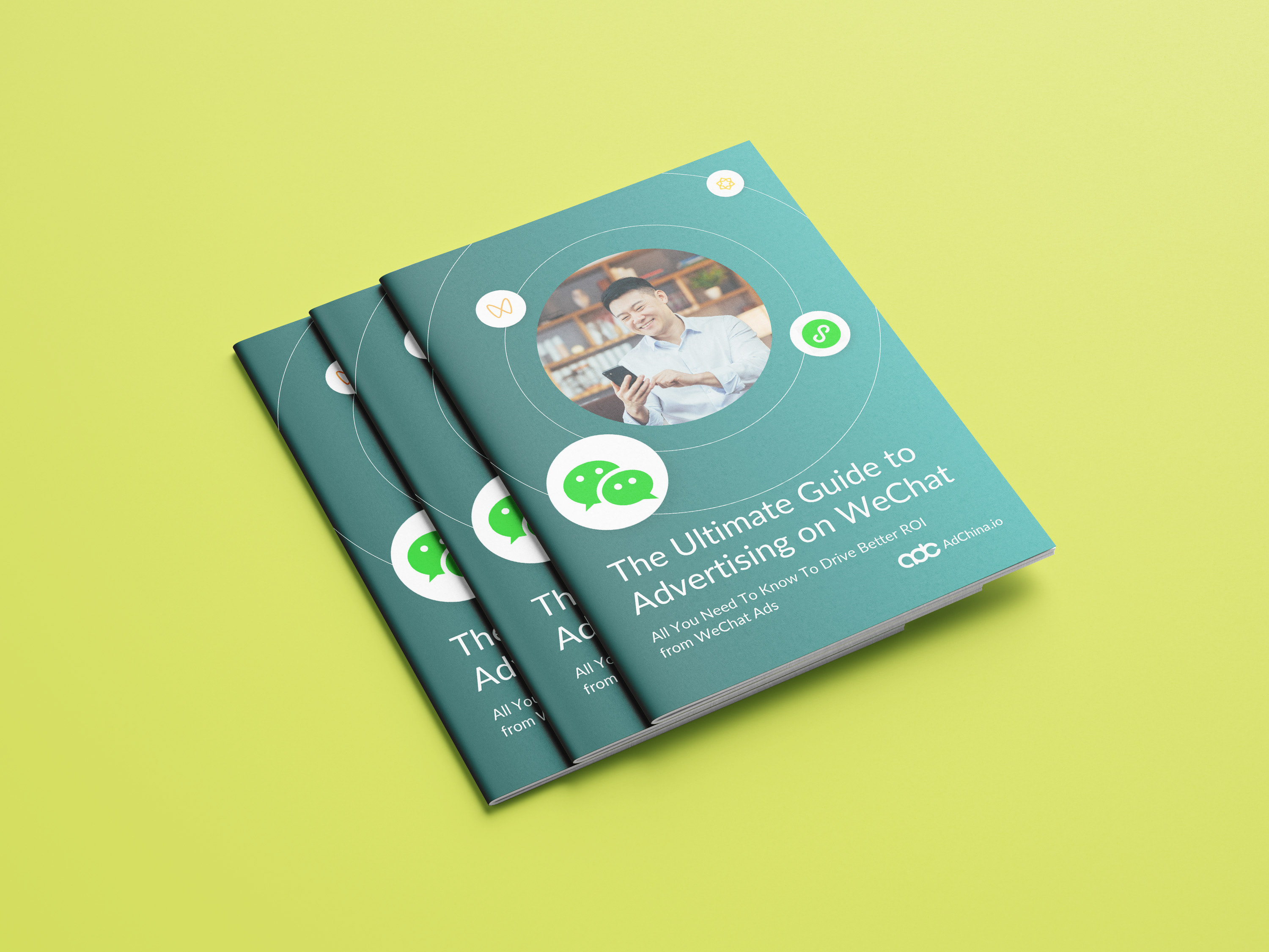
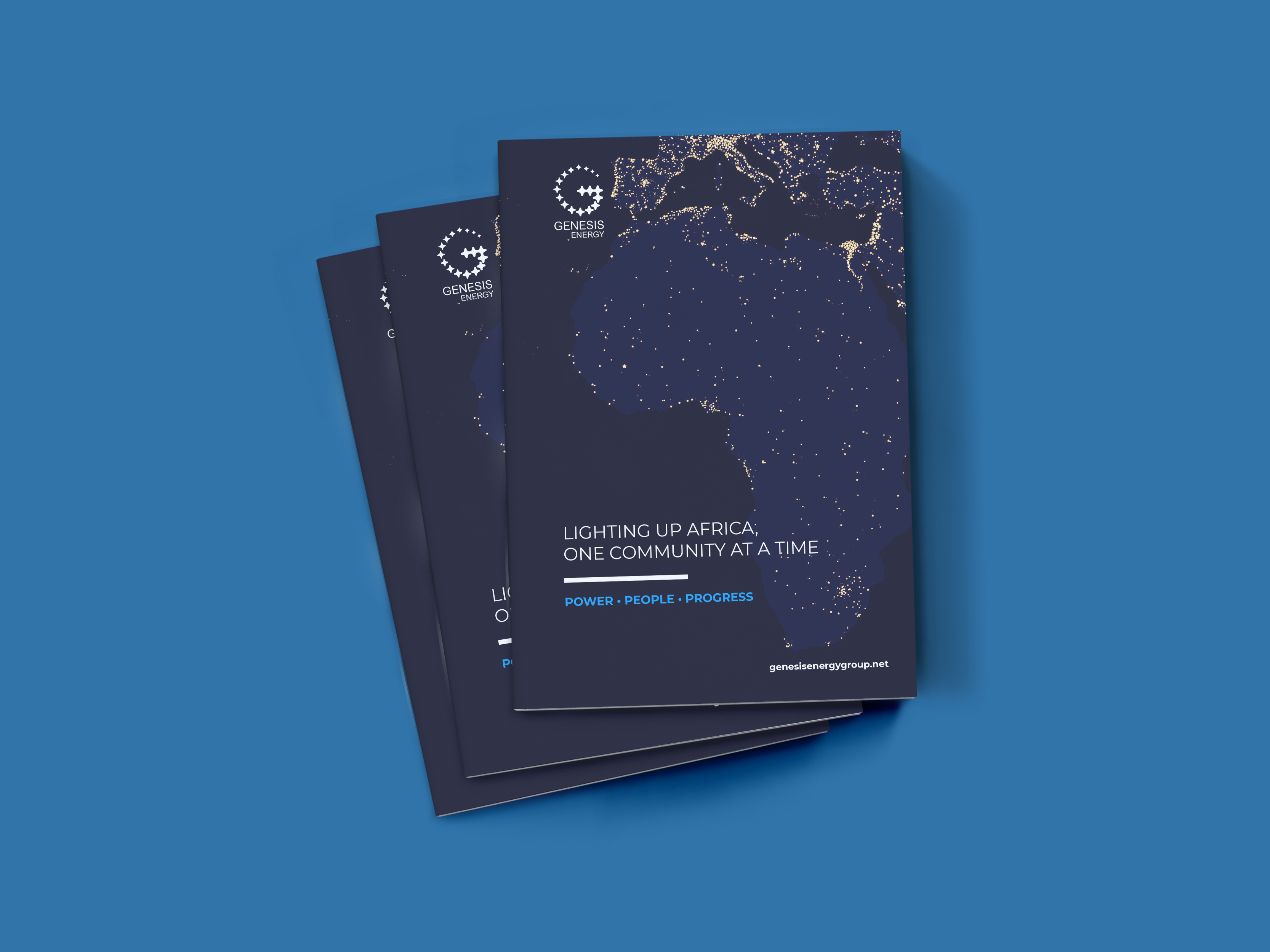
I refreshed the structure, tone, and visual language of the profile to align with their growth narrative. The layout was redesigned for clarity and flow, and I created two formats: a landscape version for digital presentations and a portrait version for printing and distribution. The messaging was sharpened to emphasise credibility, capacity, and forward momentum.
Outcome
1. A modernised profile that clearly communicates Digiscape’s value and direction.
2. Consistent visual identity across print and digital formats.
3. Improved readiness for investor, client, and stakeholder presentations.